# Introduction to forms
- Forms collect user input for processing on the server.
- Examples of their use are in a searchbar, in user registration, in online surveys, and in e-commerce checkout.
# Tags related to forms
| Tag | Description |
|---|---|
| <form> | HTML form for user input |
| <input> | element that accepts input from user |
| <label> | defines a label for form elements |
| <textarea> | defines a multi-line input field |
| <select> | defines a (drop-down) list |
| <optgroup> | defines a group of related options in a (drop-down) list |
| <option> | defines an option in a (drop-down) list |
| <fieldset> | groups related elements in a form |
| <legend> | defines a caption for a fieldset element |
| <button> | defines a clickable button |
# The <form> tag
# Action Attribute
- The 'action' attribute defines where the form data is sent.
- It usually contains the URL of a server-side script (like PHP, Python, or Node.js) to process the form data.
<form action="https://it-fact.be/form.php">
    <!-- Form fields go here -->
</form>
2
3
# Method Attribute
- The 'method' attribute specifies the HTTP method used to send the form data.
- The two most common methods are 'GET' and 'POST'.
<form action="https://it-fact.be/form.php" method="post">
    <!-- Form fields go here -->
</form>
2
3
GET VS POST REQUEST
- GET is typically used when you want to retrieve data. Imagine a search bar in a webshop. When you type in the product name and hit search, your browser sends a GET request to the server to fetch the relevant data. This request doesn't change anything on the server, it only retrieves information. The form data is visible in the URL.
- POST is used when you want to send data to the server. Consider a registration form on a website. When you enter your information and hit the submit button, your browser sends a POST request to the server with the data you provided. This request can potentially change the state on the server - for example, a new user record will be created in the database. The form data is not visible in the URL.
In summary, use GET when you need to fetch data and POST when you need to send data.
# HTTP Requests
# Understanding HTTP methods
HTTP defines a set of request methods to indicate the desired action to be performed for a given resource. Here is a brief overview of these methods:
GET: Requests a representation of the specified resource. Requests using GET should only retrieve data and should have no other effect.POST: Used to submit data to be processed to a specified resource.PUT: Replaces all current representations of the target resource with the request payload.PATCH: Used to apply partial modifications to a resource.DELETE: Deletes the specified resource.
# Importance of <label>
The <label> tag plays a crucial role in forms as it links form controls with their respective labels. It provides the following benefits:
- Labels make it easier for users to understand the purpose of a form control.
- Labels are essential for users who rely on assistive technologies such as screen readers.
- Clickability: Associating labels with form controls allow users to click on the label text, activating the associated control.
To associate a label with a form control, you can use the for attribute on the <label> tag and specify the id attribute of the corresponding form control element.
<label for="name">Name:</label>
<input type="text" id="name" name="name">
2
Accessibility Best Practices
When designing forms, it is crucial to consider accessibility to ensure that all users, including those with disabilities, can access and use the forms effectively. Here are some best practices to follow:
- Provide meaningful and descriptive labels
- Ensure proper form control focus
- Provide clear error messages and validation
# Form inputs
# <input></input>
- Form data can be collected from 'input' elements.
- They can have different 'types' like 'text', 'checkbox', 'radio', 'password', etc.
<form action="https://it-fact.be/form.php" method="post">
    <input type="text" name="username">
    <input type="password" name="password">
    <input type="submit" value="Submit">
</form>
2
3
4
5
- The 'type' attribute determines the kind of input.
- The 'name' attribute defines the variable name for the form data.
- The 'value' attribute sets the initial value or label of the input field.
# HTML Input Types
| Type | Description |
|---|---|
text (opens new window) | A single-line text field. |
password (opens new window) | A single-line text field where characters are masked (usually shown as asterisks). |
search (opens new window) | A single-line text field for searching. |
url (opens new window) | A single-line text field for entering a URL. |
email (opens new window) | A single-line text field for entering an email address. |
hidden (opens new window) | An invisible input field that can be used to store form data. |
button (opens new window) | A push button that can be clicked to trigger an action. |
submit (opens new window) | A button that submits the form. |
reset (opens new window) | A button that resets the form to its default state. |
file (opens new window) | A file upload field. |
checkbox (opens new window) | A checkbox that can be checked or unchecked to select or deselect an option. |
radio (opens new window) | A radio button that can be selected to choose one option from a group of options. |
image (opens new window) | An image submit button. |
color (opens new window) | A color picker field. |
date (opens new window) | A date picker field. |
datetime-local (opens new window) | A date and time picker field that includes both the date and time (with no time zone). |
month (opens new window) | A month picker field. |
number (opens new window) | A field for entering a numeric value. |
range (opens new window) | A slider for selecting a numeric value within a specified range. |
tel (opens new window) | A field for entering a telephone number. |
time (opens new window) | A time picker field. |
week (opens new window) | A week picker field. |
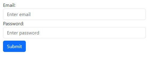
# Interactive example:
<form action="https://it-fact.be/form.php" method="post">
    <p>
        <label for="username">Username:</label>
        <input type="text" id="username" name="username">
    </p>
    <p>
        <label for="password">Password:</label>
        <input type="password" id="password" name="password">
    </p>
    <p>
        <input type="submit" value="Submit">
    </p>
</form>
# Radio Buttons
Radio buttons are used when you want the user to select only one option from a set. Grouping radio buttons with the same name ensures that selecting one will unselect any other selected option in the group. The unique id makes sure the input can be linked to a label.
<!-- Radio Buttons Example -->
<label for="option1">Option 1</label>
<input type="radio" id="option1" name="group1" value="option1">
<label for="option2">Option 2</label>
<input type="radio" id="option2" name="group1" value="option2">
2
3
4
5
# Checkboxes
Checkboxes allow users to select multiple options. Each checkbox needs a unique name to handle the input data and id for specific labeling.
<!-- Checkboxes Example -->
<label for="check1">Check 1</label>
<input type="checkbox" id="check1" name="check_first" value="check1">
<label for="check2">Check 2</label>
<input type="checkbox" id="check2" name="check_second" value="check2">
2
3
4
5
# <textarea></textarea>
- Defines a multi-line text input field.
- Often used to collect user inputs like comments or reviews.
| attribute | required/optional | description |
|---|---|---|
| rows | optional | specifies the visible number of lines in a textarea |
| cols | optional | specifies the visible width of a textarea |
<form action="https://it-fact.be/form.php" method="post">
    <p>
        <label for="remarks">Remarks:</label>
    </p>
    <p>
        <textarea rows="5" cols="25" id="remarks" name="remarks"></textarea>
    </p>
    <p>
        <input type="submit" value="Send">
    </p>
</form>
# <select></select>
- Creates a (drop-down) list.
| attribute | required/optional | description |
|---|---|---|
| size | optional | defines the number of visible options in a (drop-down) list (default = 1 results in a dropdown list) |
# <option></option>
- The
<option>tags inside theselectelement define the available options in the (drop-down) list.
| attribute | required/optional | description |
|---|---|---|
| value | optional | specifies the value to be sent to the server (by default, the text of the <option> tag is sent) |
| selected | optional | specifies that an option should be pre-selected when the page loads |
# <optgroup></optgroup>
- Groups related options in a
selectelement. - If you have a long list of options, groups of related options are easier to handle for a user.
| attribute | required/optional | description |
|---|---|---|
| label | required | specifies the name of the group of options |
<form action="https://it-fact.be/form.php" method="post">
    <p>
        <label for="city">City: </label>
    </p>
    <p>
        <select id="city" name="city">
            <option value="G">Geel</option>
            <option value="T">Turnhout</option>
            <option value="H">Herentals</option>
            <option value="M" selected>Mol</option>
        </select>
    </p>
    <p>
        <label for="activity">Choose an activity: </label>
    </p>
    <p>
        <select id="activity" size="8" name="activity">
            <optgroup label="Indoor">
                <option value="snk">Snooker</option>
                <option value="drts">Darts</option>
            </optgroup>
            <optgroup label="Outdoor">
                <option value="tennis" selected>Tennis</option>
                <option value="soccer">Soccer</option>
                <option value="geoc">Geocaching</option>
            </optgroup>
        </select>
    </p>
    <p>
        <input type="submit" value="Send">
    </p>
</form>
# <button></button>
Defines a clickable button, which can be used in forms or anywhere in a document for clickable actions.
# Button Types
The type attribute of the <button> element specifies the button's behavior when it is clicked. Here are the common types:
| Type | Description |
|---|---|
submit | The button submits the form data to the server (this is the default if the attribute is not specified). |
reset | The button resets all the form fields to their initial values. |
button | A clickable button that can be used to attach JavaScript behaviors without submitting the form. |
<!-- Example of different button types -->
<button type="submit">Submit</button>
<button type="reset">Reset</button>
<button type="button" onclick="alert('Button clicked')">Click Me</button>
2
3
4
# Form Validation
- Client-side validation involves validating user input directly in the web browser using HTML5 attributes and JavaScript.
- It allows for real-time feedback and helps prevent invalid form submissions.
DANGER
Client-side validation can be bypassed by users. We need server-side validation to prevent this. You will learn server-side validation in the Web Application in PHP course.
TIP: novalidate
If you want to quickly test if a form value is sent correctly you can add the novalidate attribute on the form element. This will disable all form validations (required, min, max, ...) when submitting the form. Make sure to remove this attribute when you're done testing!
# Required Fields
The required attribute ensures that a field must be filled out before the form can be submitted. For example:
<input type="text" name="name" required>
# Pattern Matching
The pattern attribute allows you to specify a regular expression pattern that the input value must match. This is useful for validating specific formats like email addresses, phone numbers, or ZIP codes. Here's an example:
<input type="text" name="phone" id="phone" pattern="0(\d{2,3}\/\d{6}|\d\/\d{7})" >
TIP
In this course, we expect you to be able to use existing patterns rather than create them from scratch. However, if you choose to pursue a career as a web developer, learning how to create and work with regular expression patterns can be beneficial.
# Styling Forms
# Interesting CSS selectors
Apart from the foundational CSS selectors like id, class, and parent selectors that you already know, a range of specific selectors can significantly improve form styling:
| selector | description |
|---|---|
| div > p | child selector: selects all p elements that are the children of a div element |
| input:valid | selects every input element that has a valid value |
| input:invalid | selects every input element that has an invalid value |
| label[for] | selects all label elements with the for attribute |
| input[type="submit"] | selects all input elements where the type attribute equals submit |
| a[href^="https"] | selects every a element whose href attribute value begins with https |
| a[href$=".pdf"] | selects every a element whose href attribute value ends with .pdf |
Want to become a CSS selecting pro?
If you want to learn everything there is to know about CSS selectors, check out the following recourses:
- The Flukeout CSS Diner game (opens new window)
- For an extra challenge: Frontend30 CSS selectors cheat sheet (opens new window) in game modus
# CSS Styling
CSS can be used to style form elements, including changing the color, size, font, and more. Here's an example of how you can use CSS to style an <input> element:
input[type="text"] {
    width: 100%;
    padding: 12px 20px;
    margin: 8px 0;
    box-sizing: border-box;
    border: 2px solid red;
    border-radius: 4px;
}
2
3
4
5
6
7
8
# Bootstrap Styling
In this example, the form is styled using Bootstrap's .form-group and .form-control classes, and the submit button is styled using the .btn and .btn-primary classes.
EXTRA: UI/UX considerations for form design
When designing forms, the UI/UX design principles play a crucial role in determining how user-friendly your form is. It's not just about how your form looks, but also how it works. Here are some key points to consider:
- Simplicity: Keep your form as simple and straightforward as possible. Only ask for information that you absolutely need.
- Clarity: Make sure it's clear what information goes in each field. Use clear and concise labels for each input.
- Feedback: Provide feedback wherever possible. If there's an error in the form, let users know what's wrong and how they can fix it.
- Consistency: Keep the design and layout of your form consistent to avoid confusing users.
- Accessibility: Your form should be accessible to all users, including those with disabilities. Consider things like font size, color contrast, and form control focus.
# Fieldset and Legend
While not as commonly used as other form elements, the <fieldset> and <legend> tags offer an additional layer of structure and accessibility to web forms.
# <fieldset>
The <fieldset> element is used to group related elements within a form. It draws a box around the grouped elements, providing a visual cue that these elements are related. Grouping controls together using <fieldset> is especially helpful in complex forms or surveys, where different sections of the form need to be clearly delineated.
# <legend>
The <legend> element provides a caption for the <fieldset> it is associated with. It helps users understand the context of the grouped inputs, making forms easier to navigate, especially for those using assistive technologies like screen readers.
# Interactive Example
<section id="form">
    <form action="https://it-fact.be/form.php" method="post">
        <fieldset>
            <legend>Native Belgian</legend>
            <p class="sameline">
                <input type="radio" id="yes" name="native" value="yes">
                <label for="yes">Yes</label>
            </p>
            <p class="sameline">
                <input type="radio" id="no" name="native" value="no" checked>
                <label for="no">No</label>
            </p>
        </fieldset>
        <div class="sameline">
            <p>
                <input type="submit" value="Send">
            </p>
        </div>
    </form>
</section>
* {
    margin: 0;
    padding: 0;
    box-sizing: border-box;
}

html {
    font-size: 16px;
}

body {
    font-family: 'Roboto', sans-serif;
}

h1 {
    margin-bottom: 1.5rem;
}

#form {
    max-width: 700px;
    margin: auto;
    padding: 0.5rem;
}

label {
    display: block;
    margin-bottom: .5rem;
}

input[type="radio"] {
    width: auto;
    margin-right: .35rem;
    background: none;
}

input[type="submit"] {
    color: #fff;
    background-color: #0d6efd;
    border-color: #0d6efd;
    padding: .375rem .75rem;
    cursor: pointer;
    font-size: 1rem;
    margin-top: 2rem;
}

.sameline {
    display: flex;
}

fieldset {
    padding: .75rem;
}
# A styled sample form
<section id="form">
    <form action="https://it-fact.be/form.php" method="post">
        <h1>Register</h1>
        <p>
            <label for="name">Name<sup>*</sup></label>
            <input id="name" size="40" maxlength="20" name="name" placeholder="Enter your name" autofocus required>
        </p>
        <p>
            <label for="password">Password</label>
            <input type="password" id="password" size="15" maxlength="20" name="paswoord" value="test">
        </p>
        <p>
            <input type="hidden" name="userid" value="-1">
        </p>
        <p>
            <label for="url">Website</label>
            <input type="url" id="url" name="url" placeholder="your website url">
        </p>
        <p>
            <label for="zip">Zip code</label>
            <input type="text" id="zip" name="zip" pattern="[0-9]{4}">
        </p>
        <p>
            <label for="email">Email<sup>*</sup></label>
            <input type="email" id="email" name="email" required>
        </p>
        <p>
            <label for="range">jQuery knowledge
                 (<output id="jquery">10</output>%)
            </label>
            <input type="range" id="range" name="range" min="0" max="100" step="5" value="10"
                oninput="jquery.value = range.value">
        </p>
        <p>
            <label for="age">Current age</label>
            <input type="number" id="age" name="age" min="17" max="100" step="1" value="18">
        </p>
        <p>
            <label for="query">Popular search term</label>
        </p>
        <p>
            <label for="tel">Tel</label>
            <input type="tel" id="tel" name="tel">
        </p>
        <p>
            <label for="tel2">Tel 2<sup>*</sup></label>
            <input type="tel" id="tel2" name="tel2" pattern="0(\d{2,3}\/\d{6}|\d\/\d{7})" required>
        </p>
        <p class="sameline">
            <input type="checkbox" id="car" name="mobility1" value="car">
            <label for="car"> I own a car</label>
        </p>
        <p class="sameline">
            <input type="checkbox" id="bike" name="mobility2" value="bike" checked>
            <label for="bike"> I own a bike </label>
        </p>
        <p class="sameline">
            <input type="radio" id="drivinglicense" name="driving" value="ja">
            <label for="drivinglicense">I have a driving license</label>
        </p>
        <p class="sameline">
            <input type="radio" id="nodrivinglicense" name="driving" value="neen" checked>
            <label for="nodrivinglicense">I don't have a driving license</label>
       <p>
            <label for="remarks">Remarks:</label>
        </p>
        <p>
            <textarea rows="5" cols="25" id="remarks" name="remarks"></textarea>
        </p>
        <p>
            <label for="city">City: </label>
        </p>
        <p>
            <select id="city" name="city" size="3">
                <option value="G">Geel</option>
                <option value="T">Turnhout</option>
                <option value="H">Herentals</option>
                <option value="M" selected>Mol</option>
            </select>
        </p>
        <p>
            <label for="activity">Choose an activity: </label>
        </p>
        <p>
            <select id="activity" size="8" name="activity">
                <optgroup label="Indoor">
                    <option value="snk">Snooker</option>
                    <option value="drts">Darts</option>
                </optgroup>
                <optgroup label="Outdoor">
                    <option value="tennis" selected>Tennis</option>
                    <option value="soccer">Soccer</option>
                    <option value="geoc">Geocaching</option>
                </optgroup>
            </select>
        </p>
        <fieldset>
            <legend>Native Belgian</legend>
            <p class="sameline">
                <input type="radio" id="yes" name="native" value="yes">
                <label for="yes">Yes</label>
            </p>
            <p class="sameline">
                <input type="radio" id="no" name="native" value="no" checked>
                <label for="no">No</label>
            </p>
        </fieldset>
        <div class="sameline">
            <p>
                <input type="submit" value="Send">
            </p>
            <p>
                <input type="reset" value="Reset">
            </p>
        </div>
    </form>
</section>
* {
    margin: 0;
    padding: 0;
    box-sizing: border-box;
}

html {
    font-size: 16px;
}

body {
    font-family: 'Roboto', sans-serif;
}

h1 {
    margin-bottom: 1.5rem;
}

#form {
    max-width: 700px;
    margin: auto;
    padding: 0.5rem;
}

label {
    display: block;
    margin-bottom: .5rem;
}

input, textarea {
    display: block;
    padding: .375rem .75rem;
    border: 1px solid #ced4da;
    border-radius: .25rem;
    margin-bottom: 1rem;
    width: 100%;
}

select, textarea, fieldset {
    margin-bottom: 1rem;
}

input:focus, textarea:focus, select:focus {
    outline: none;
    box-shadow: 0 0 5px 3px lightskyblue;
}

input[type="range"] {
    padding-left: 0;
    padding-right: 0;
}

input[type="range"]:focus {
    box-shadow: none
}

input:invalid {
    border-color: #dc3545;
    background-image: url("data:image/svg+xml,%3csvg xmlns='http://www.w3.org/2000/svg' viewBox='0 0 12 12' width='12' height='12' fill='none' stroke='%23dc3545'%3e%3ccircle cx='6' cy='6' r='4.5'/%3e%3cpath stroke-linejoin='round' d='M5.8 3.6h.4L6 6.5z'/%3e%3ccircle cx='6' cy='8.2' r='.6' fill='%23dc3545' stroke='none'/%3e%3c/svg%3e");
    background-repeat: no-repeat;
    background-position: right .4em center;
    background-size: 1.1em 1.1em;
}

input:valid {
    border-color: #198754;
    background-image:url("data:image/svg+xml,%3csvg xmlns='http://www.w3.org/2000/svg' viewBox='0 0 8 8'%3e%3cpath fill='%23198754' d='M2.3 6.73L.6 4.53c-.4-1.04.46-1.4 1.1-.8l1.1 1.4 3.4-3.8c.6-.63 1.6-.27 1.2.7l-4 4.6c-.43.5-.8.4-1.1.1z'/%3e%3c/svg%3e");
    background-repeat: no-repeat;
    background-position: right .4em center;
    background-size: 1.1em 1.1em;
}

input[type="date"],
input[type="number"],
input[type="submit"],
input[type="radio"],
input[type="checkbox"] {
    width: auto;
    margin-right: .35rem;
    background: none;
}

input[type="submit"] {
    color: #fff;
    background-color: #0d6efd;
    border-color: #0d6efd;
    padding: .375rem .75rem;
    cursor: pointer;
    font-size: 1rem;
    margin-top: 2rem;
}

input[type="submit"]:hover {
    background-color: darkblue;
}

input[type="reset"] {
    color: #fff;
    background-color: orange;
    border-color: orange;
    padding: .375rem .75rem;
    cursor: pointer;
    font-size: 1rem;
    margin-top: 2rem;
}

input[type="reset"]:hover {
    background-color: red;
}

.sameline {
    display: flex;
}

fieldset {
    padding: .75rem;
}
KEEP IN MIND
The form above is used as an example. In this state, the styling is not sufficient to be sold to any client.