# Bootstrap Sass
Now that we know (the basics of) Sass and Bootstrap, we can combine the best of both worlds and start using Bootstrap in a more advanced way.
# Project set-up
# GitHub repository
Start by cloning (or downloading) the sass-bs-example (opens new window) repository from GitHub. If you use git clone ..., you can safely delete the .git folder (as you are no collaborator on this repo)
The folder structure of this project is similar to the structure of the group project files: the Sass code is stored in the folder scss, while the dist folder contains all files (HTML, CSS and JS) for production.
# npm install
When you open this project in PhpStorm, the following pop-up appears at the bottom right of your IDE. Either click on Run 'npm install' or type the command npm install (or npm i) in a terminal:

This command installs the required Node packages (specified under "devDependencies" in package.json) in a folder node_modules. Besides the package bootstrap, several other packages (browser-sync, gulp-sass, ...) needed for the Gulp-based workflow (see below) are
installed
{
  ...
  "devDependencies": {
    "bootstrap": "^5.3.0",
    "browser-sync": "^2.27.11",
    "gulp": "^4.0.2",
    "gulp-autoprefixer": "^8.0.0",
    "gulp-css-mqpacker": "^1.0.1",
    "gulp-dart-sass": "^1.0.2",",
    "gulp-notify": "^4.0.0",
    "gulp-plumber": "^1.2.1",
    "gulp-sourcemaps": "^3.0.0"
  }
}
2
3
4
5
6
7
8
9
10
11
12
13
14
REMARK
More background information (on npm install, dependencies, ...) can be found on the course page Tools > npm
# Bootstrap source code
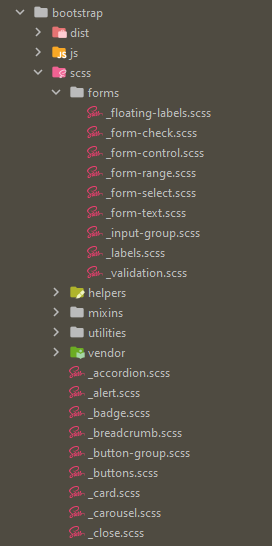
The Bootstrap Sass source code now can be found in the folder node_modules/bootstrap/scss, where you see:
- 38 partials (starting with
_) - 4 SCSS files bootstrap.scss, bootstrap-grid.scss, bootstrap-reboot.scss and bootstrap-utilities.scss (which can be compiled separately to corresponding CSS files)
- 5 subfolders
- In the subfolder forms you can find all the partials for styling form elements as described in the Form section of the Bootstrap documentation (opens new window)
- In the subfolder helpers you can find all the partials that contain the helper elements documented in the Helpers section of the Bootstrap documentation (opens new window)
- In the subfolder mixins you can find all the mixins that are used by the Bootstrap development team, but that you can also use yourself
- In the subfolder utilities and the partial _utilities.scss you find the code of the classes documented in the Utilities section of the Bootstrap documentation (opens new window)
- The subfolder vendor only contains 1 partial _rfs.scss, dealing with responsive font sizes (opens new window) (developed by Martijn Cuppens of IO, Herentals)
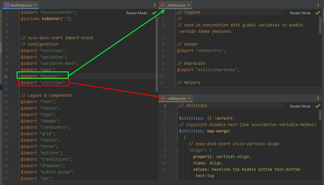
In the file bootstrap.scss all partials (in the map scss) are imported. The partials in the subfolders are imported via the partials _mixins.scss (everything from the folders mixins and vendor) and _utilities.scss (everything from the folder utilities). Of course, the order of these imports is important: variables and mixins have to be known before you can use them, ...
REMARK: Bootstrap GitHub repo
As you can see (in README.md), the Bootstrap source code originates from a repository on GitHub (https://github.com/twbs/bootstrap/ (opens new window)) with more than
1300 contributors and 22000 commits 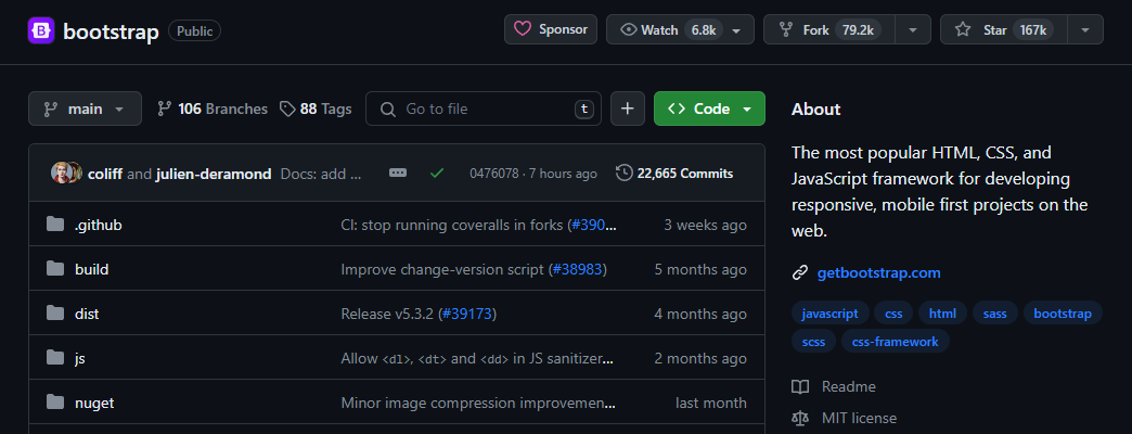
WARNING
Do NOT change anything in Bootstrap's source code (bootstrap.scss, partials, ...).
All changes that are necessary to meet the
wishes of your client should be done in other files (that refer to the original source code), as explained below. Anyone who deviates from this will have major problems (i.e. you will lose
your changes) during an
update of the
framework!
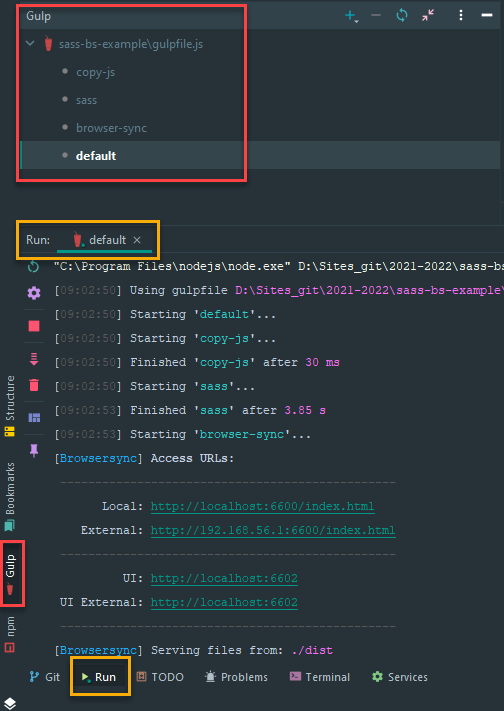
# Gulp workflow
We will automate your previous workflow (based on live-server and sass compilation) even further. We will use Gulp, which is a task manager to automate repeated tasks in your workflow. All Gulp configurations are stored in gulpfile.js:
...

// Compile sass into CSS (/dist/css/)
gulp.task('sass', () => {...
});

// Live-reload the browser
gulp.task('browser-sync', () => {...
});

gulp.task('default', gulp.series('sass', 'browser-sync'));
2
3
4
5
6
7
8
9
10
11
In this file, 3 tasks are defined:
- a task
sassthat compiles the Sass code in scss/style.scss to dist/css/style.css (the file which is linked to in dist/index.html)- The resulting CSS file will include the complete (potentially modified) Bootstrap CSS code as well, so we don't need a CDN link anymore
- a task
browser-syncthat launches a browser that stays "in sync":- if the Sass code changes, it will be recompiled
- if there is any change in HTML, CSS or JS code, the browser is reloaded
- a
defaulttask that launches all previous tasks in series
REMARK
More background information (and the detailed code of these Gulp tasks) can be found on the course page Tools > Gulp
These Gulp tasks can be launched:
- using the commands
gulp <task-name>in a terminal window (in the project folder sass-bs-example)- The
defaulttask can be started bygulp defaultor justgulp
- The
- by double-clicking the corresponding tasks in the Gulp tool window (right-click within the editor window of gulpfile.js and choose Show Gulp Tasks)
TIP
Note that the package.json file also contains the following script:
{
    ...
    "scripts": {
        "watch": "gulp"
    },
    ...
}
2
3
4
5
6
7
This means that the default Gulp task can also be started by npm run watch!
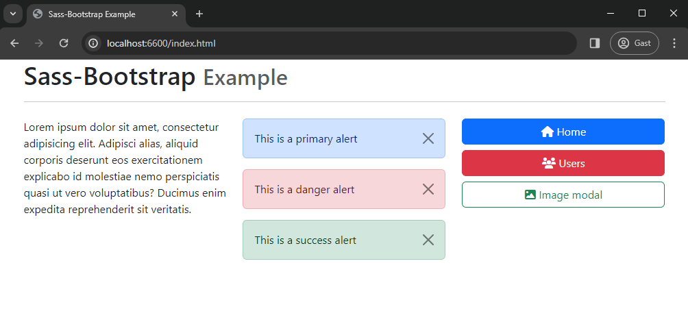
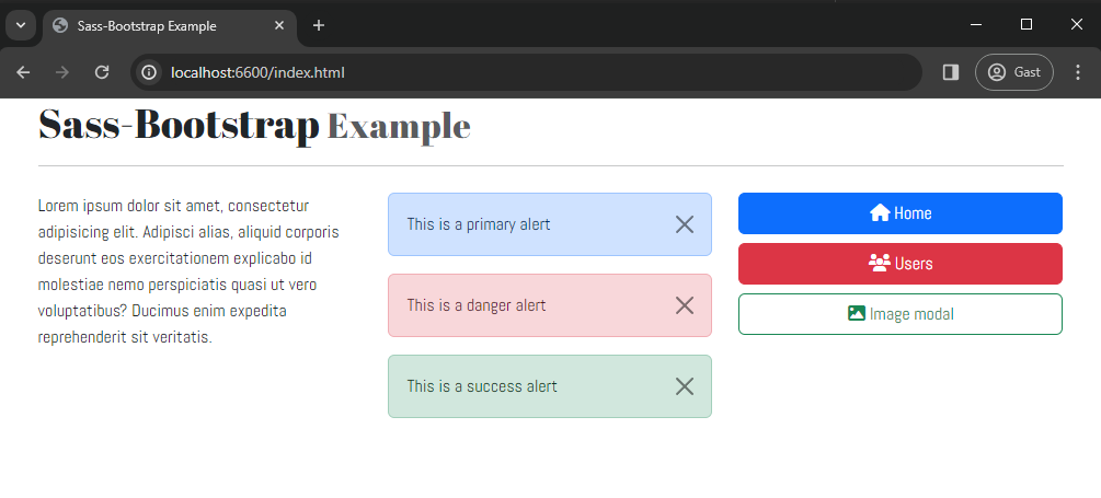
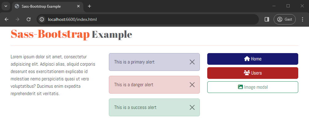
The result after starting the default Gulp task shows the index page, on which some (standard) Bootstrap classes are applied:
# Theming Bootstrap
If you study the content of scss/style.scss, you will notice that it consists only of @import statements, one of which
(line 25) imports bootstrap.scss (from the folder node_modules).
As the other files (_variables.scss, _maps.scss and _custom.scss) contain no (uncommented) code for now, our compiled file dist/style.css basically is a compiled version of Bootstrap
/* import Font Awesome and Google font(s) */
@import url('https://cdnjs.cloudflare.com/ajax/libs/font-awesome/6.5.1/css/all.min.css');
@import url('https://fonts.googleapis.com/css2?family=Abel&family=Abril+Fatface&display=swap');

// 1. Include functions first (so you can manipulate colors, SVGs, calc, etc)
@import "../node_modules/bootstrap/scss/functions";

// 2. Include any default variable overrides here
@import "variables";

// 3. Include remainder of required Bootstrap stylesheets (including any separate color mode stylesheets)
@import "../node_modules/bootstrap/scss/variables";
@import "../node_modules/bootstrap/scss/variables-dark";

// 4. Include any default map overrides here
@import "maps";

// 5. Include remainder of required parts
@import "../node_modules/bootstrap/scss/maps";
@import "../node_modules/bootstrap/scss/mixins";
@import "../node_modules/bootstrap/scss/utilities";
@import "../node_modules/bootstrap/scss/root";

// 6. Import the remainder of the Bootstrap files
@import '../node_modules/bootstrap/scss/bootstrap';

// create custom styles/partials
@import "custom";
2
3
4
5
6
7
8
9
10
11
12
13
14
15
16
17
18
19
20
21
22
23
24
25
26
27
28
# Order of imports is important!
- On top of the file, we import the external CSS libraries we want to use besides Bootstrap, e.g:
- Font Awesome for extra icons
- Google fonts to override the default font that Bootstrap uses
- Import your local variables file (e.g. _variables.scss) AFTER the Bootstrap functions and BEFORE the Bootstrap variables
- Import your local maps file (e.g. _maps.scss) AFTER the Bootstrap variables and BEFORE the Bootstrap maps
- Import your local styles (e.g. _custom.scss) AT THE END of the file
# Custom variables and Bootstrap variables
First, take a closer look at the Bootstrap variables file node_modules/bootstrap/scss/_variables.scss (Tip: Ctrl+click on the file name in PhpStorm)
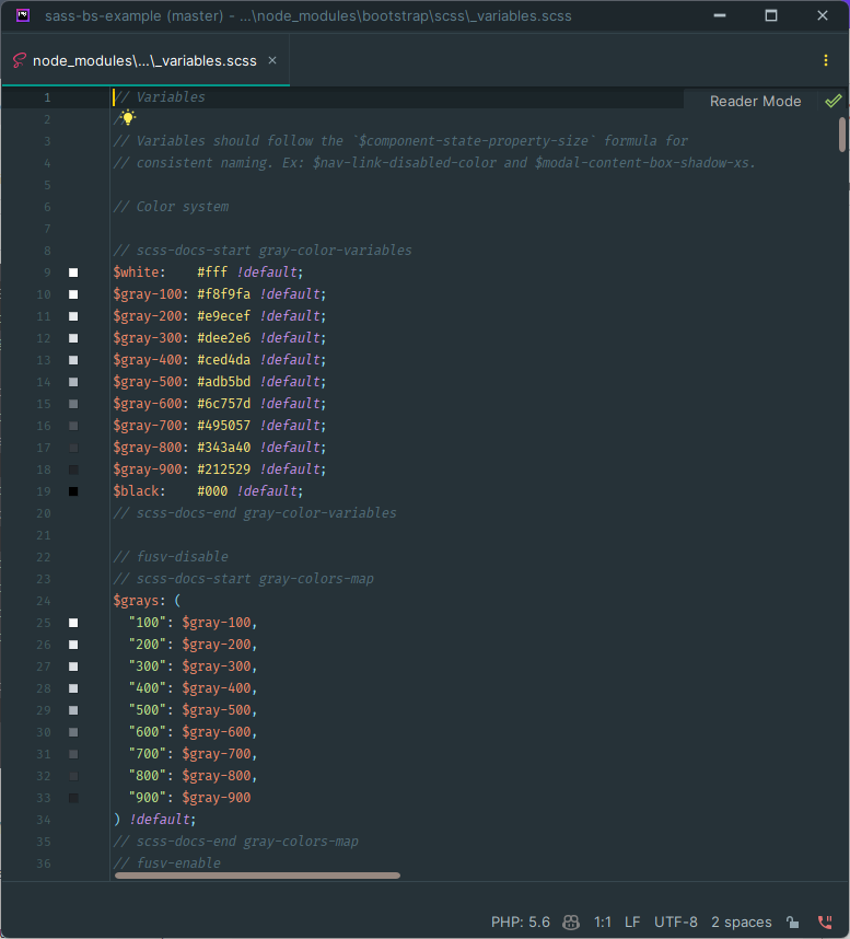
Every Sass variable in Bootstrap includes the !default flag (see also Sass documentation > Default Values (opens new window)), which
allows you to override the variable’s default value in your own Sass files (without modifying Bootstrap’s source code).
That's why we import our local variables file JUST BEFORE the Bootstrap ../node_modules/bootstrap/scss/variables.
TIP
It's not that easy to read the source code to find out which variables are available in Bootstrap! Luckily, the Bootstrap documentation contains a Sass section for every chapter, where you can find more information how to customize the chapter’s variables, maps, components, ...
Let's do some quick examples to demonstrate how to override Bootstrap variables and add our own variables that can be used in our custom styles
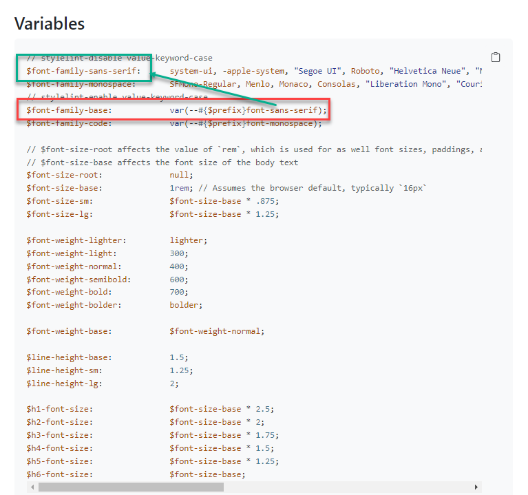
# Overwrite the default font family
Let's change the default font family for the entire site (See documentation Utilities > Text (opens new window))
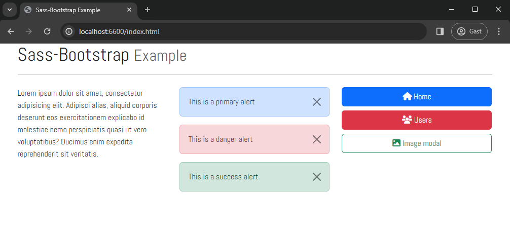
In the browser, the font changes:
# Custom styles
All your custom styles (styles that are not part of Bootstrap) should be placed in a separate file (e.g. scss/_custom.scss) AT THE END of the scss/style.scss file
# Custom header styles
By default, Bootstrap uses only 1 font. We want to use an additional font for the headings (h1, h2, h3, h4, h5, h6):
- with a self-chosen name that is not used in Bootstrap, e.g.
$font-family-headers - with e.g. the Google font
'Abril Fatface'as value
Let's add some custom styles that are only used in some hx elements (h1, h2, h3, h4, h5, h6)
In the browser, the font changes:
# Custom maps and Bootstrap maps
# Colors
Bootstrap contains 29 color variables (see also Utilities > Colors (opens new window)):
- block 1: 10 color variables
- block 2: 8 variables, based on block 1 and block 3, (
$primary,$secondary,$success,$info,$warning,$danger,$light,$dark) which play a very important role in the framework - block 3: 11 black, white and grayscale variables
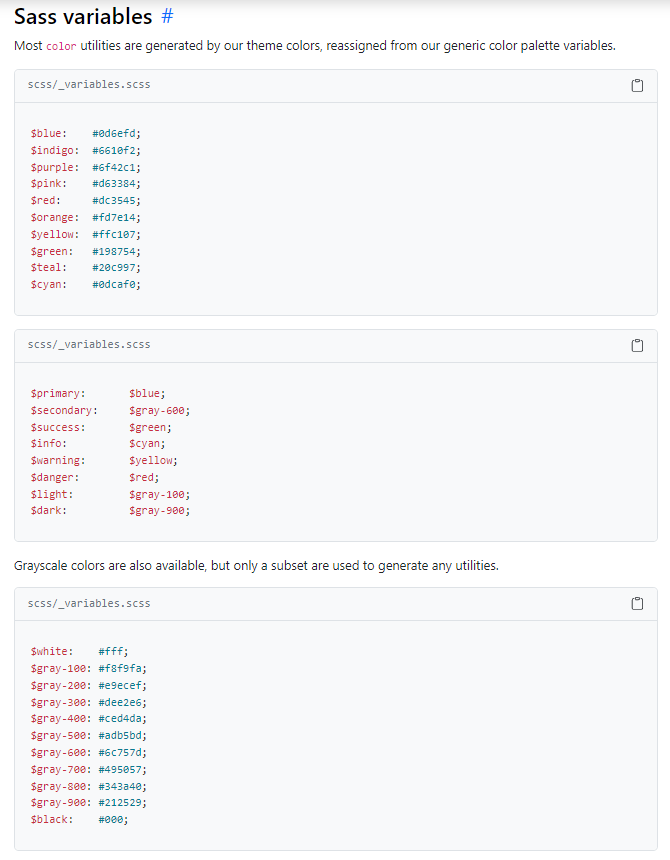
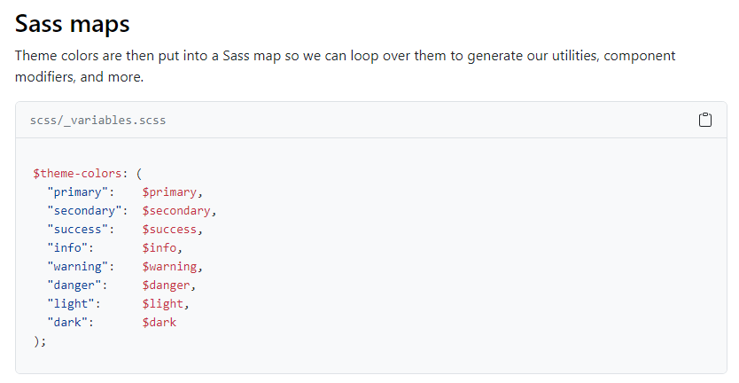
The $theme-colors map is formed by creating key:value pairs corresponding to these 8 important variables $primary, $secondary, ...
READING TIP
# Overwrite the default theme-colors map and add a new color to the map
The default primary color for the $theme-colors map is set to the variable $primary:
- The variable
$primaryis equal to the variable$blue - The variable
$blueis equal to the color#0d6efd(Pfff... a lot of variables and colors here) - We can to overwrite the
$bluevariable to change the default primary color
The default danger color for the $theme-colors map is set to the variable $danger:
- The variable
$dangeris equal to the variable$red - The
$redvariable is equal to the color#dc3545 - Overwrite the
$redvariable to change the default danger color
As such, in the resulting CSS code
- the colors used in all
...-primaryand...-dangerclasses are changed - a new family of classes
...-itf(.btn-itf,.text-itf,bg-itf, ...) is added
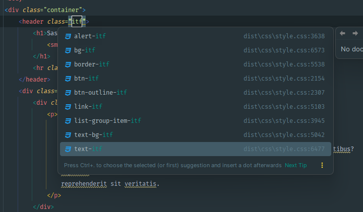
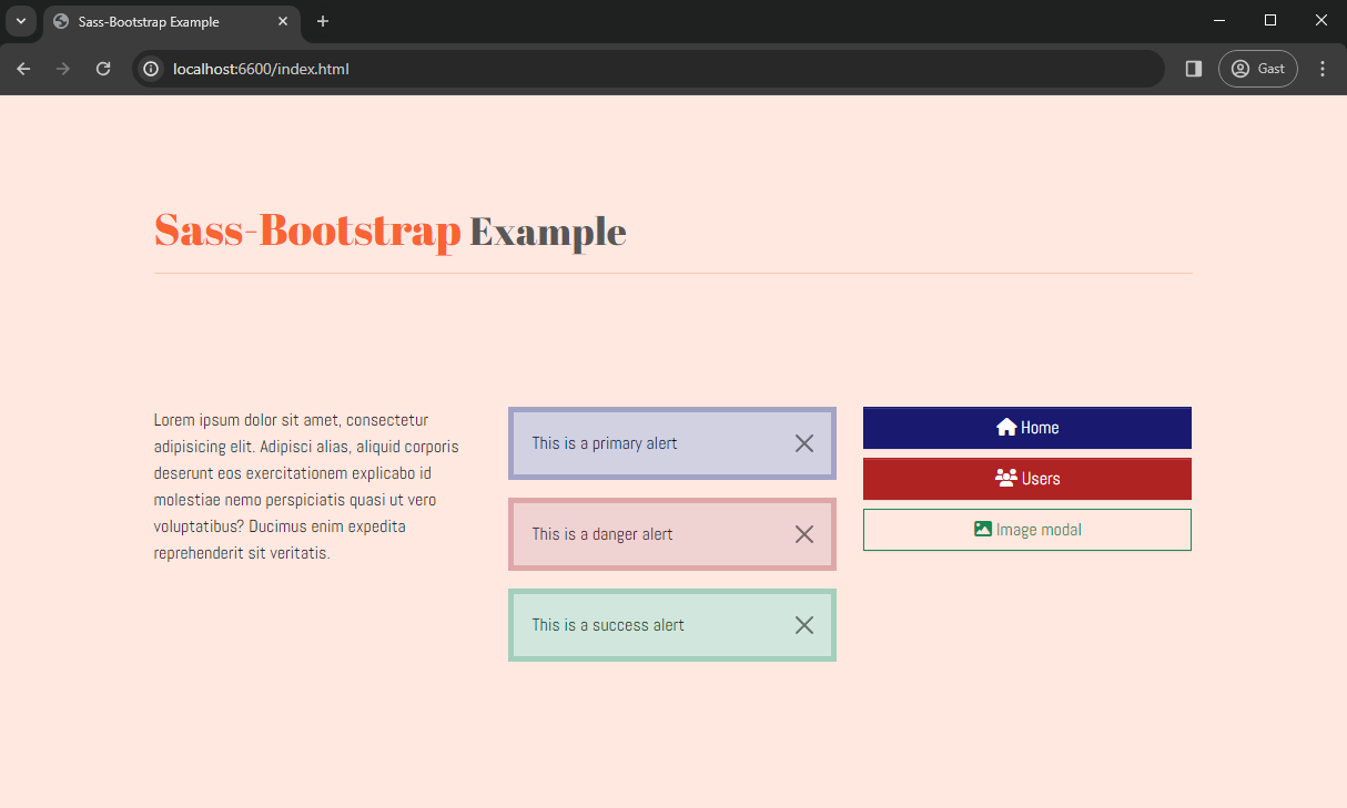
Add the class .text-itf to the header element in index.html and watch the result in the browser:
# Advanced customization
Now that you know how to customize Bootstrap, you can start to create your own Bootstrap theme. It's impossible to give an overview of all the variables defined in bootstrap/scss/_variables.scss here. It's not necessary to adjust/override them all.
Some interesting possibilities:
$enable-variables allow you to quickly modify global styling by enabling/disabling optional features$spacers-map allowing you to modify or add margin/padding classes$body-variables allowing to change thecolorandbackground-colorof thebodyelement$link-variables for styling anchor elements$table-variables for customizing tables- variables related to specific components (forms/input fields, navbar, cards, tooltips, modals, alerts, ...)
- ...
# Enable/disable optional features
In the example:
- we removed the rounding from the components (alerts, buttons, ...) and enabled the box-shadows (e.g. around the modal window) (see also Customize > Options (opens new window))
- we added a key:value pair to the
$spacersmap in order to have additional margin/padding classes (.m-6,.px-6, ...) available (see also Utilities > Spacing (opens new window)) - we changed the default
background-colorof thebodyelement - we increased the thickness of the borders around alerts (see also Components > Alerts (opens new window))
- add an extra value to the
$spacersmap
Add the class .py-6 to the header element to add a large vertical padding around it: <header class="text-itf py-6">
# More custom styles
It is considered to be good practice to check first whether you can realize the desired result by adjusting some properties or adding extra style rules to (an) existing Bootstrap class(es).
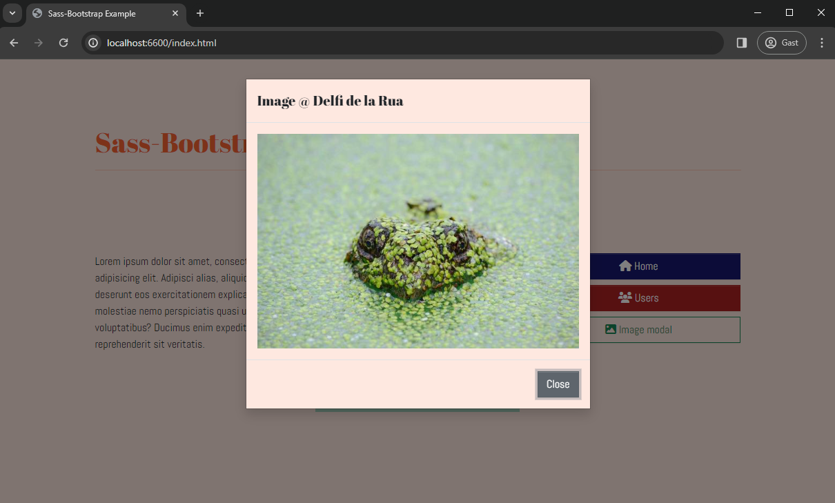
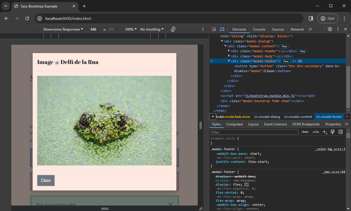
Example: you want the 'Close' button in the modal to be aligned to the left. Inspect the CSS code and observe that the .modal-footer class (containing the 'Close' button) is flex-based with justify-content: flex-end; 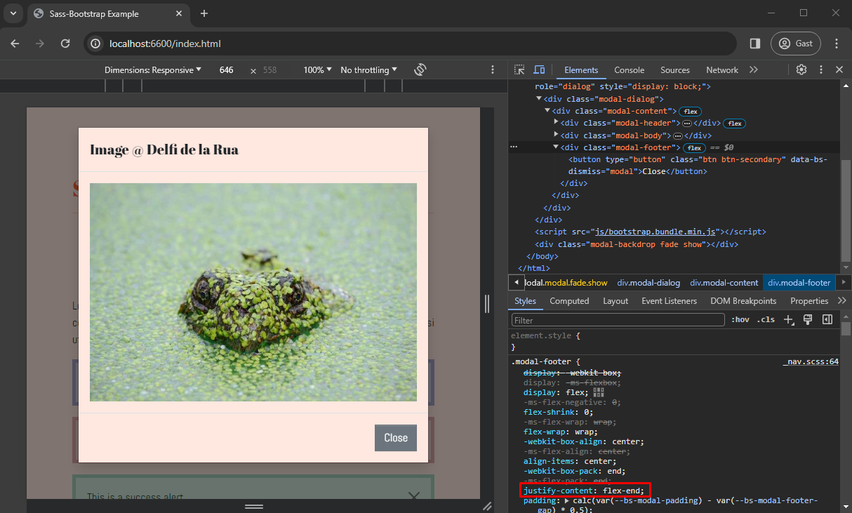
# media-breakpoint-up
The breakpoints are defined in a map $grid-breakpoints (see: Layout > Breakpoints (opens new window) 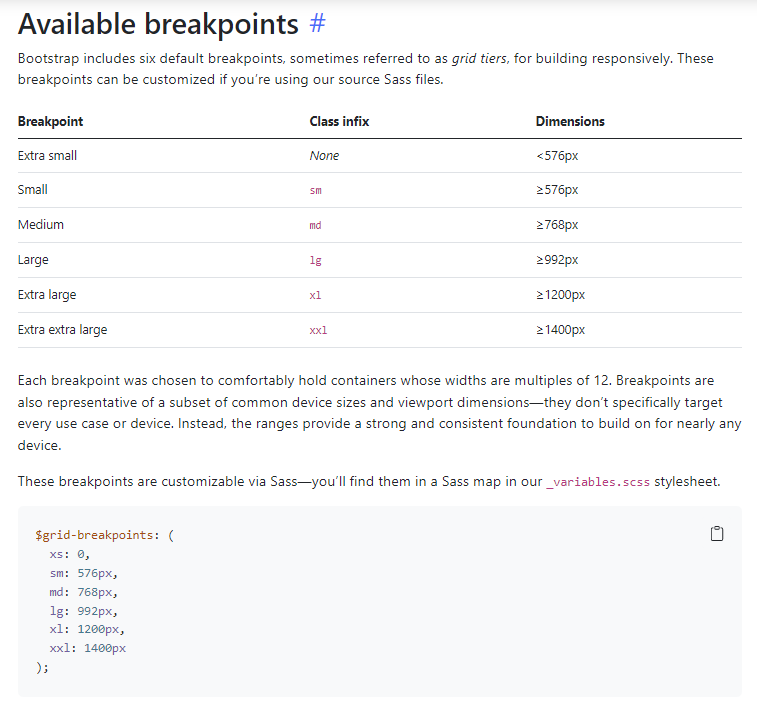
Yet, as the values are not stored in separate variables, we cannot refer to them in a @media (min-width: ...) query, and also the use of the keys (e.g. @media (min-width: md)) won't do the job.
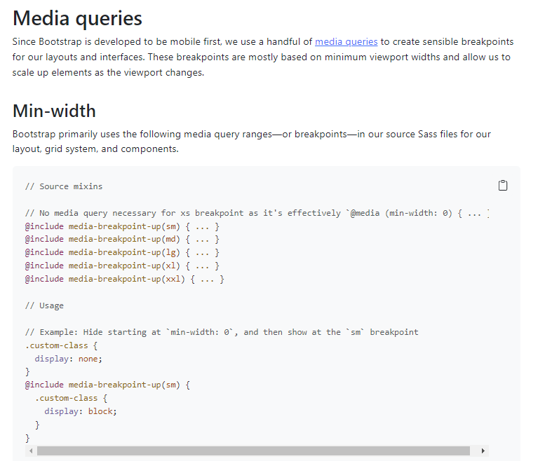
Luckily, the useful mixin media-breakpoint-up() comes to the rescue (see: Layout > Mediaqueries (opens new window))
If we want to "darken" the background-color for increasing screen sizes (mobile first!), we include the following code in scss/_custom.scss.
The mixin searches for the breakpoint-value (corresponding to md or lg) in the $breakpoints map and copies the content in a correct @media() query, as shown in the corresponding compiled CSS code.