# CSS Variables
CSS Variables, also known as Custom Properties, are powerful tools that allow you to define reusable values within your stylesheets. They enable you to manage styles more efficiently, make your code more readable, and create dynamic themes that can be easily updated.
In this chapter, we'll explore how to declare, use, and manage CSS variables, including how they interact with scope and inheritance, and how to perform calculations with them.
# Declaring Variables
CSS variables are declared using a double hyphen prefix (--) followed by the variable name, like --primary-color.
They can be declared within any CSS selector, but it's a common practice to declare them inside the :root pseudo-class.
The :root selector represents the root element of the document, which is usually the <html> element.
This ensures that the variables are accessible throughout the entire document.
Here's how you can declare variables within the :root selector:
:root { --font-family: Arial, sans-serif; --base-font-size: 16px; --small-font-size: 12px; --color: black; --background-color: lightgray; --base-spacing: 1rem; --small-spacing: 0.5rem; --primary-color: orangered; --secondary-color: purple; }Copied!
2
3
4
5
6
7
8
9
10
11
Note
By declaring variables in :root, we ensure that they are available globally, meaning any element can use them.
However, it is also possible to declare variables inside other selectors, in that case, they will only be available in
the scope of the elements matched by that selector and its descendants.
# Using Variables
Once variables are declared, you can use them in your CSS rules with the var() function.
The var() function takes the name of the variable as its first argument.
Here's an example of how to use the variables declared in the previous section:
html { font-family: var(--font-family); font-size: var(--base-font-size); } body { background-color: var(--background-color); padding: var(--base-spacing); } h1 { color: var(--primary-color); margin-bottom: var(--base-spacing); } .btn { background-color: var(--primary-color); color: white; padding: var(--small-spacing) var(--base-spacing); margin: var(--base-spacing) 0; text-decoration: none; display: inline-block; } .btn-small { font-size: var(--small-font-size); background-color: var(--secondary-color); }Copied!
2
3
4
5
6
7
8
9
10
11
12
13
14
15
16
17
18
19
20
21
22
23
24
Note
When using the var() function, you can also provide a fallback value as the second argument.
This fallback value will be used if the variable is not defined or invalid.
(E.g., --color: 123; is invalid because 123 is not a valid color value).
.btn { background-color: var(--secondary-color, #2ecc71); padding: var(--spacing-medium, 10px); color: white; }Copied!
2
3
4
5
# Scope and Inheritance
CSS variables follow the standard CSS cascade rules and have a scope. When a variable is declared, it is only accessible within the scope of the element where it is defined and its descendants, except where overridden by a redefinition of the variable in a descendant scope.
If a variable is not found in the current scope, the browser will look up through the DOM tree to find it in an ancestor scope, in the same way CSS properties are inherited.
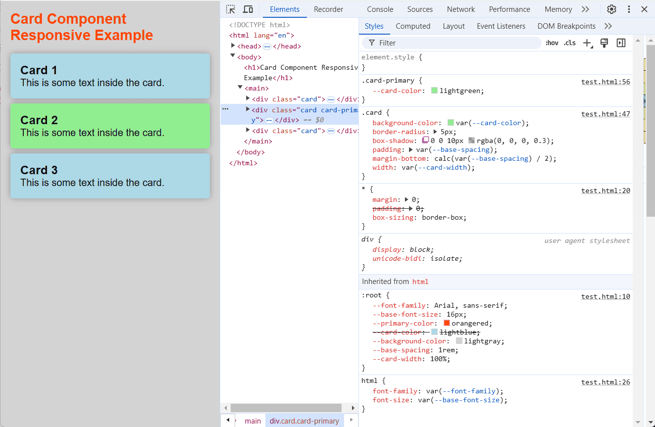
This concept is very useful when building components. Let's see an example:
In this example, we have 3 card components:
- The first and third cards have the default
.cardclass. - The second card has an additional
.card-primaryclass.
.card { background-color: var(--card-color); border-radius: 5px; box-shadow: 0 0 10px rgba(0, 0, 0, 0.1); padding: var(--base-spacing); margin-bottom: var(--base-spacing); } .card-primary { --card-color: lightgreen; }Copied!
2
3
4
5
6
7
8
9
10
For the second card, we redefine the --card-color variable to lightgreen so it overrides the default value of --card-color which is lightblue.
# Calculations with Variables
CSS variables can be used in mathematical expressions using the calc() function. This allows you to perform calculations based on the values of variables, making your styles more dynamic and responsive to changes. The calc() function is particularly useful when you need to derive one value from another or when you want to make adjustments to existing values without hardcoding them.
Let's illustrate this concept using the card component that we are using as example. Imagine you want to set the margin-bottom of our card to be half of the spacing used for padding, that is defined by the variable --base-spacing:
:root { --font-family: Arial, sans-serif; --base-font-size: 16px; --primary-color: orangered; --card-color: lightblue; --background-color: lightgray; --base-spacing: 1rem; } .card { background-color: var(--card-color); border-radius: 5px; box-shadow: 0 0 10px rgba(0, 0, 0, 0.1); padding: var(--base-spacing); /* Using calc to set the margin-bottom to half of the base-spacing */ margin-bottom: calc(var(--base-spacing) / 2); } .card-primary { --card-color: lightgreen; }Copied!
2
3
4
5
6
7
8
9
10
11
12
13
14
15
16
17
18
19
In this example, we've modified the .card selector to include margin-bottom: calc(var(--base-spacing) / 2);.
This line uses the calc() function to divide the value of the --base-spacing variable by 2 and applies the result
as the margin-bottom value for the cards.
Note
The calc() function is versatile and can handle different units of measurement, even within the same expression,
and supports the standard mathematical operations:
- Addition (
+) - Subtraction (
-) - Multiplication (
*) - Division (
/)
IMPORTANT
- The operators
+and-should have at least one space before and after them, otherwise the expression won't work. - The operators
*and/do not require spaces. - The
calc()function can also handle mixed units, so calculations likecalc(100% - 20px)are perfectly valid and common.
In summary, the combination of CSS variables and the calc() function provides a powerful mechanism for creating flexible
and dynamic layouts.
You can easily adjust styles by changing a single variable, and the calc() function ensures that
all dependent values will be recalculated automatically. This is very useful for making components responsive and adaptable
to different scenarios.
# Working with Media Queries
CSS variables can be used together with media queries to create responsive designs that adapt to different screen sizes and devices. By changing the values of your CSS variables within media queries, you can adjust the styling of your components, including their layout, spacing, typography, and colors, based on the characteristics of the viewport. This approach allows you to maintain a single source of truth for your styles while creating variations for different contexts.
Let's build upon the card component from the previous sections and make it responsive using media queries and CSS variables. We will start with a mobile-first approach and then add adjustments for larger screens.
# Mobile Version
First, let's start with the base styles for the mobile version of our card component.
:root { --font-family: Arial, sans-serif; --base-font-size: 16px; --primary-color: orangered; --card-color: lightblue; --background-color: lightgray; --base-spacing: 1rem; --card-width: 100% } * { margin: 0; padding: 0; box-sizing: border-box; } html { font-family: var(--font-family); font-size: var(--base-font-size); } body { background-color: var(--background-color); padding: var(--base-spacing); } h1 { /* Responsive font size based on viewport width */ font-size: calc(var(--base-font-size) + 2vw); color: var(--primary-color); margin-bottom: var(--base-spacing); } h2 { /* Responsive font size based on viewport width */ font-size: calc(var(--base-font-size) + 1vw); } .card { background-color: var(--card-color); border-radius: 5px; box-shadow: 0 0 10px rgba(0, 0, 0, 0.3); padding: var(--base-spacing); margin-bottom: calc(var(--base-spacing) / 2); width: var(--card-width); } .card-primary { --card-color: lightgreen; }Copied!
2
3
4
5
6
7
8
9
10
11
12
13
14
15
16
17
18
19
20
21
22
23
24
25
26
27
28
29
30
31
32
33
34
35
36
37
38
39
40
41
42
43
In the mobile version, all the cards are stacked on top of each other.
Note
Pay special attention to the font-size properties for h1 and h2 elements.
We are using the calc() function to make them responsive based on the viewport width (vw).
h1font size is calculated asvar(--base-font-size) + 2vw(or16 pixelsplus2%of the viewport width).h2font size is calculated asvar(--base-font-size) + 1vw(or16 pixelsplus1%of the viewport width).
PS: Bootstrap also uses this technique to make its typography responsive 😊.
# Tablet Versions
Let's add another media query, for larger screens, where we are going to display the cards in a flexbox layout instead of stacked.
- First, we need to redefine the
--card-widthvariable to a fixed value of340pxfor tablets and above. - The
mainelement will be set todisplay: flexto create a flexbox layout, and the cards will be spaced out usingjustify-content: space-between. - We also give the
h1andh2elements larger font sizes and adjust the padding on the body (they are not responsive anymore). - The body width is set to
768pxto center the content on larger screens.
@media (min-width: 768px) { :root { --card-width: 340px; /* Card width for tablets and above */ } body { width: 768px; margin: 0 auto; padding: calc(var(--base-spacing) * 2); } h1 { font-size: calc(var(--base-font-size) * 2); margin-bottom: calc(var(--base-spacing) * 2); } h2 { font-size: calc(var(--base-font-size) * 1.3); } main { display: flex; /* Use flexbox for card layout */ flex-wrap: wrap; /* Allow cards to wrap to new lines */ justify-content: space-between; /* Space out the cards */ } .card { margin-bottom: var(--base-spacing); flex: 0 1 var(--card-width); } }Copied!
2
3
4
5
6
7
8
9
10
11
12
13
14
15
16
17
18
19
20
21
22
23
24
25
26
# Desktop Version
@media (min-width: 1024px) { :root { --card-width: 300px; /* Card width for desktops */ } body { width: 1024px; } }Copied!
2
3
4
5
6
7
8
In this media query:
- We redefine the
--card-widthvariable to300pxfor desktop screens. - We set the body width to
1024px.
# Print Styles
Now, let's finish by adding some print styles to make the page more printer-friendly.
@media print { body { background-color: white; /* set the background to white for printing */ padding: 0; /* remove padding for print */ color: black; /* set the text color to black for printing */ } .card { box-shadow: none; /* remove box shadow for printing */ margin-bottom: var(--base-spacing); /* add margin bottom for printing */ } }Copied!
2
3
4
5
6
7
8
9
10
11
In this print media query:
- We ensure the background is
whiteand the text colorblackfor better readability when printed. - We are also removing
padding,shadows, and adjusting the margin of the cards.
By combining CSS variables with media queries, you can create responsive designs that are easier to maintain and modify. The use of variables allows you to keep styles consistent while allowing for variations across different devices and contexts. This approach not only makes your code more efficient but also contributes to a more robust and scalable architecture. This example demonstrated how to use CSS variables and media queries to build a responsive card component, adapting its layout from a stacked format on small screens to a flexbox based layout on larger screens, and making also some print adjustments.
# Debugging CSS Variables
When working with CSS variables, you may encounter issues where the variables are not being applied as expected.
You can use the browser's developer tools (F12) to inspect the styles and check the values of the variables.
This can help you identify any errors in your CSS or issues with the variable declarations.
# Practice
Practice CSS Variables by executing the steps in the following repository: CSS Variables Exercise (opens new window)