In this chapter, we will explore how to customize Bootstrap using CSS variables. We'll learn how to create a custom
theme by adding variables to the :root selector, enabling us to easily apply our styles across our CSS files. We will
also modify some of Bootstrap's global settings, incorporate Bootstrap components styled with our custom theme, and even
build a custom component from scratch.
All the necessary files for this demonstration are located within the src directory. The basic project setup is
already completed, and our focus will be on customizing the Bootstrap framework.
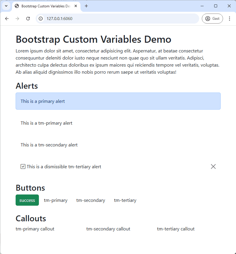
The index.html file serves as the main entry point of the project. It includes several components that we will style
using our custom theme.
The page links to main.css, where we will import all our CSS files, and to bootstrap5.3.8.min.js for Bootstrap's
JavaScript functionality.
main.css is the central CSS file for our project. In it, we will import various stylesheets, including
a Google Font(opens new window), Bootstrap's CSS, and our custom CSS files.
IMPORTANT: Ensure that you import the Bootstrap CSS file BEFORE any custom CSS files. This order
is crucial for your custom styles to correctly override Bootstrap's default styles.
The files (root.css, content.css, alert.css, button.css, callout.css) are currently empty, but we
will populate them in the following steps.
/* Google fonts for this site */@importurl("https://fonts.googleapis.com/css2?family=Inter:ital,opsz,wght@0,14..32,100..900&display=swap");/* Bootstrap and Bootstrap Icons */@import"bootstrap/bootstrap5.3.8.min.css";@import"https://cdnjs.cloudflare.com/ajax/libs/bootstrap-icons/1.13.3/font/bootstrap-icons.min.css";/* Global CSS */@import"root.css";@import"content.css";/* Components */@import"components/alert.css";@import"components/button.css";@import"components/callout.css";
Let's begin by establishing a custom theme for our project. We will utilize the following color palette for this
example:
tm-primary #f04b20
tm-secondary #009cab
tm-tertiary #f0cf1f
tm-slate #546363
NAMING CONVENTION
We will follow the naming convention tm-<color-name> for our custom theme colors. You are free to use any naming
scheme, provided it does not conflict with existing Bootstrap class names.
Using suffixes like primary, secondary, and tertiary facilitates easy switching between different themes in the
future.
The suffix text will be used for text and background colors within our theme.
Now, let's create CSS variables for our chosen colors and add them to the :root selector within the root.css file.
Because root.css is imported after Bootstrap's CSS, our custom theme colors will override Bootstrap's defaults. This
allows us to introduce custom properties that we can then utilize throughout our CSS.
TIP
We have created a simple web tool to help you generate various shades of a color.
We can further customize the styling by modifying properties of standard HTML tags within our project. This can be
accomplished in the content.css file.
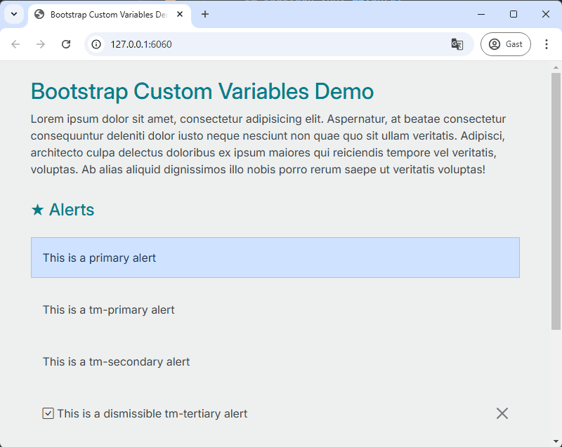
Open the file src/css/content.css and apply the following changes to heading tags:
Set the color of all heading tags (h1 to h6) to #007d89 and the font-size to 2rem.
For the h2 tag, add a top and bottom padding of 1rem and set the font-size to 1.5rem.
Add a ::before pseudo-element to the h2 tag with the content "★ ".
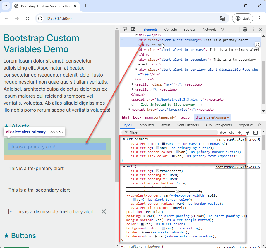
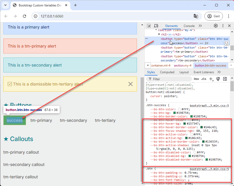
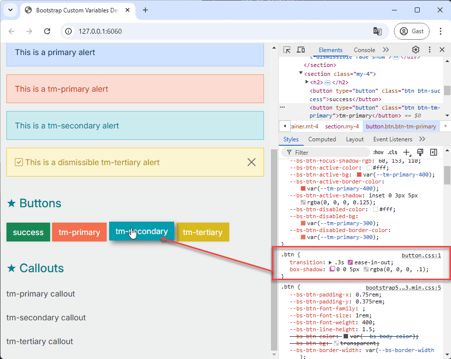
To identify the CSS variables used within Bootstrap components, the most effective method is to inspect the source code
using your browser's developer tools. We'll start by examining a default Bootstrap component to understand which CSS
variables are in use, which will guide our customization efforts.
Inspect the primary alert component using your browser's developer tools to see the associated CSS variables.
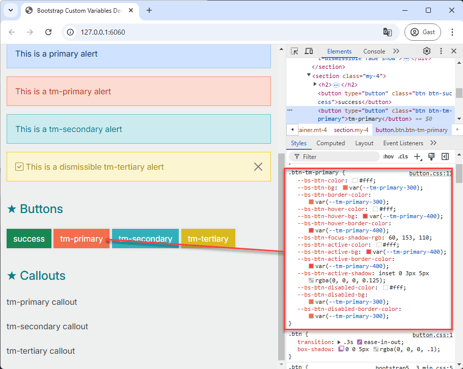
Open the file src/css/components/alert.css.
Copy the entire .alert-primary class definition from the browser's developer tools and paste it into alert.css.
Rename the class to .alert-tm-primary and update the values of the --bs-alert-color, --bs-alert-bg,
--bs-alert-border-color, and --bs-alert-link-color properties using shades from our tm-primary color palette.
Repeat this process for the .alert-tm-secondary and .alert-tm-tertiary classes.
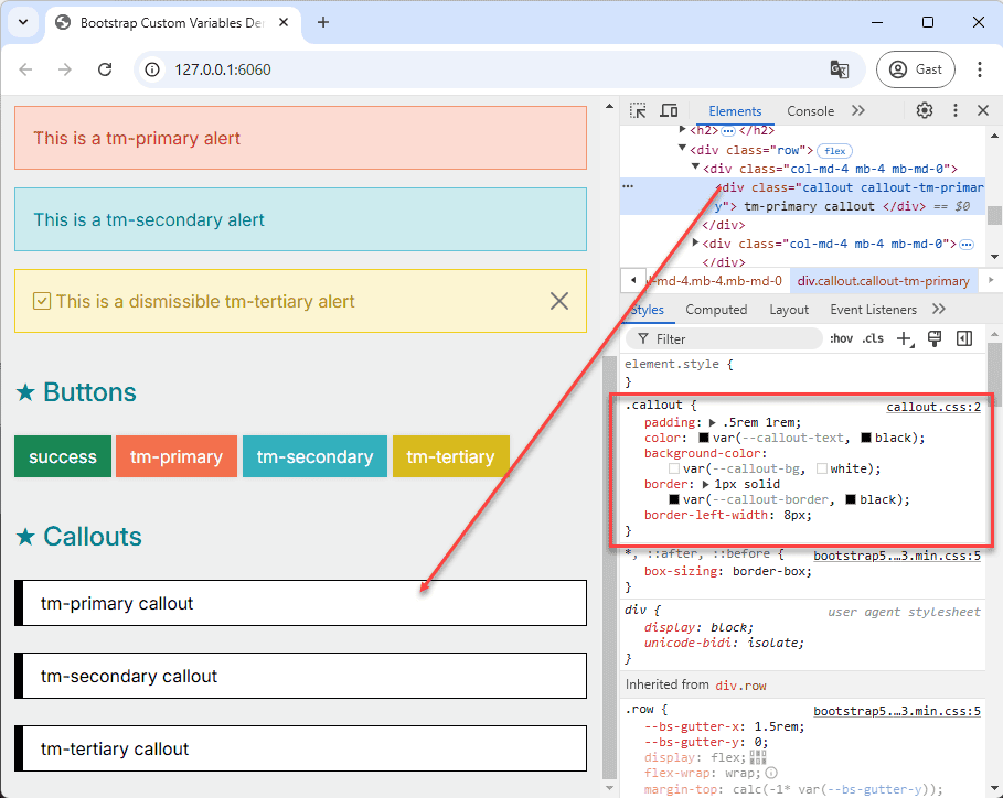
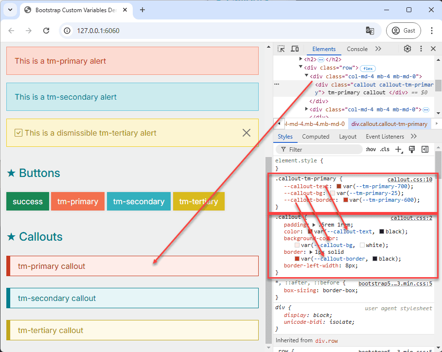
Now, let's create a custom component, the callout, which is not included in the Bootstrap framework but will be styled
with our custom theme. We'll follow a similar structure to Bootstrap's components:
A base class .callout to define general properties.
Modifier classes .callout-tm-primary, .callout-tm-secondary, and .callout-tm-tertiary for applying different
theme colors.
For this custom component, we'll use a slightly different approach:
The base class .callout will have custom properties with default fallback values.
The modifier classes will override these default values to apply our custom theme colors.
By leveraging CSS variables, we've successfully customized Bootstrap to match our desired theme. This approach allows
for a more maintainable and scalable styling system. We've seen how to override Bootstrap's default variables, style
existing components, and even create new components that seamlessly integrate with our custom theme. This methodology is
crucial for building consistent and branded web applications efficiently.